Bailiwik

Bailiwik

Bailiwik

Reducing churn with simplified host onboarding

A community-building cross-platform tool for neighbors with shared passions

Product Designer

Onboarding redesign for web app

1 Product Manager, 1 Lead Engineer

Freelance

UX

6 weeks

Bailiwik Mockup: Step 1 of new community creation

Cultivating a stronger sense of community in the neighborhood

While the project was not implemented due to external factors, the redesigned flow showed promise. The proposed onboarding experience for hosts is now more intuitive and engaging. Upon implementation, there is a potential to

100%

Number of active communities

150%

Churn rate

A community-building tool lacking community

Bailiwik launched as a cross-platform tool in 2015 to help neighbors connect and build purpose-driven communities. The client, one of Bailiwik's co-founders, revealed a troubling situation: a high churn rate and numerous inactive communities and members, putting the platform's growth and future at risk.

Aiming to better understand the client's concern, I explored the platform and noticed a limited number of communities with consistent activity. While this is not quantifiable data, it aligns with the client's concerns about user engagement.

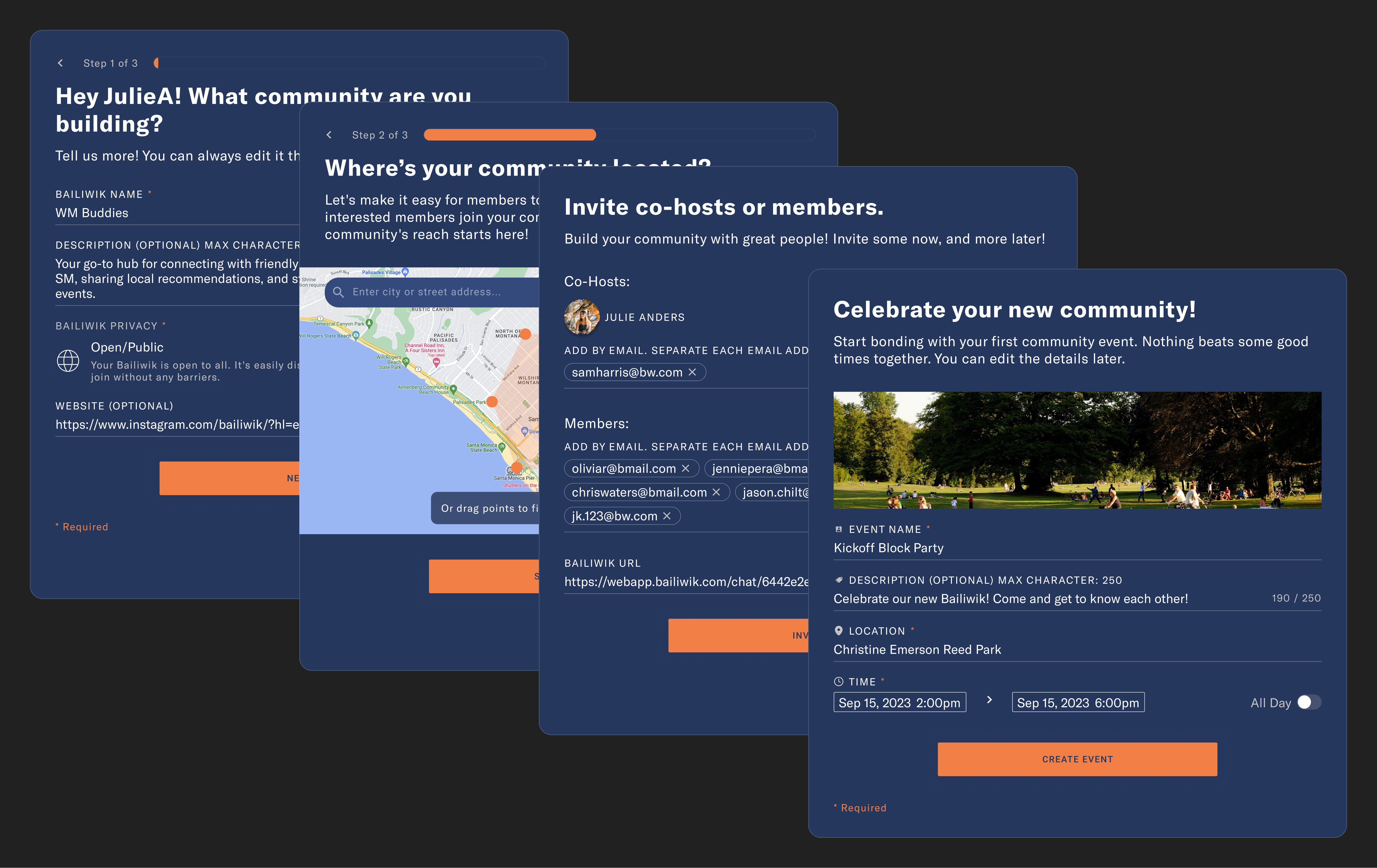
Host onboarding: add community details and select location
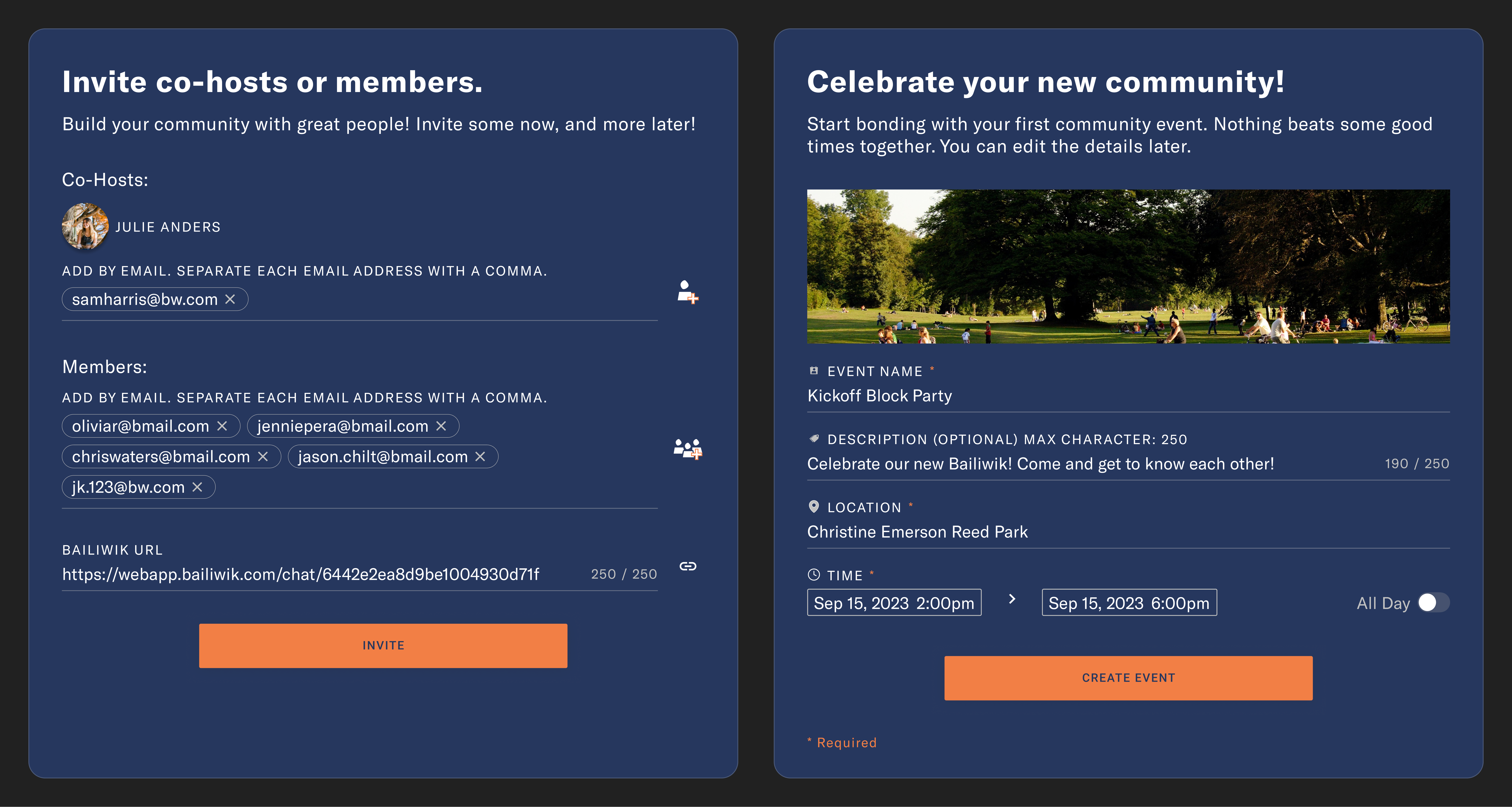
Host onboarding: invite members and create event

Final design of key screens for host onboarding with optional prompt to create community event

Data gaps and limited resources led to additional focused research effort

A recent UX research with past members revealed that Bailiwik struggled to meet users' needs for connecting over shared interests and building meaningful relationships. To make matters worse, the platform experience was not very pleasant. The research, however, never addressed users’ motivation to use community-building tools.

To learn about the why’s and how’s, I studied the competitors and conducted a quick poll with potential users, which uncovered the users’ desire for a more personalized experience based on interests and proximity.
User research: sticky notes affinity map

Quick poll sticky notes affinity map

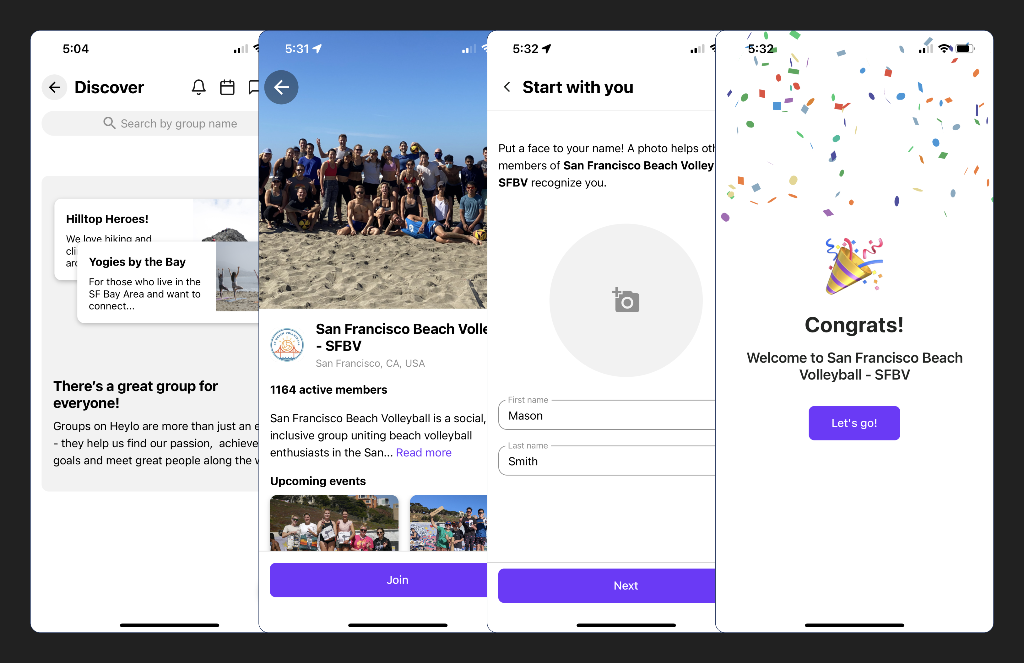
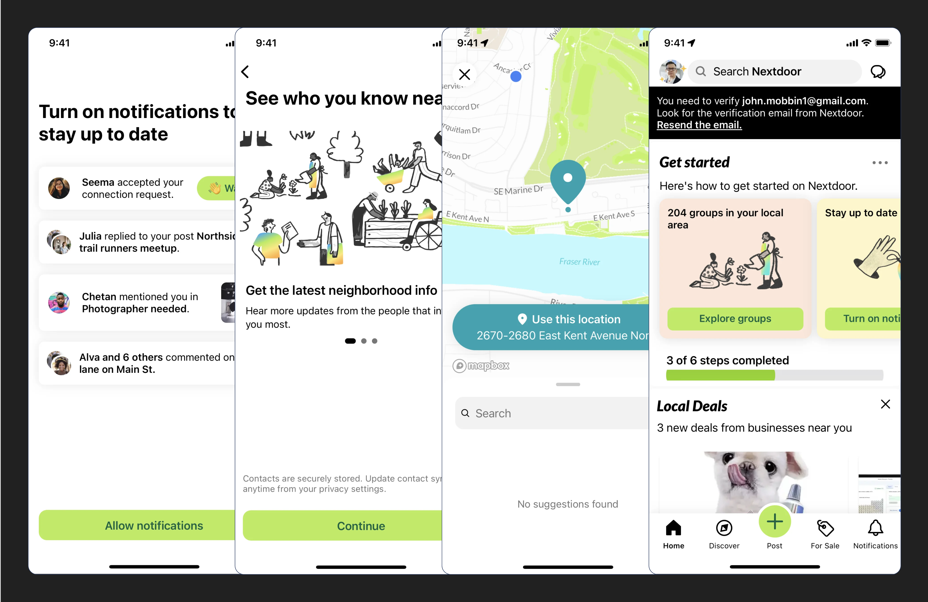
Heylo main onboarding screens on iOS

Heylo main onboarding screens on iOS

Nextdoor main onboarding screens on iOS

Nextdoor main onboarding screens on iOS

A more intentional onboarding flow for a more personalized experience

Based on the research, there are 2 major user groups on Bailiwik, the community members and the hosts. Members want to connect over shared-interests like hobbies, while hosts over shared-purpose like raising awareness for a cause. For Bailiwik’s founder, purpose is powerful in bringing people together to build meaningful communities. However, these incentives are currently missing.

Simplified member user flow (happy path) from signing up to joining groups

Simplified member user flow (happy path) from signing up to joining groups

Simplified host user flow (happy path) from signing up to creating own group

Simplified host user flow (happy path) from signing up to creating own group

Boosting host onboarding for maximum impact with limited resources

Sharing early and often for stakeholder feedback has always been part of my design process. Faced with the scarcity of time and resources, the client wanted to maximize the project impact while scaling down effort. Believing that hosts as a key to strong communities, the client suggested to aim our attention to improving the web-to-app onboarding experience only for hosts.

While all user groups are equally important, focusing on hosts offered several strategic advantages. Optimizing their experience could potentially trigger a positive ripple effect, attracting more members and building stronger communities. Additionally, given the resource constraints, it allowed us to deliver a high-impact solution within the project scope. With that, the team and I agreed to move forward with host onboarding. Aligned with the client's vision of “If you build it, they will come” mentality, I dove into analyzing the existing flow.
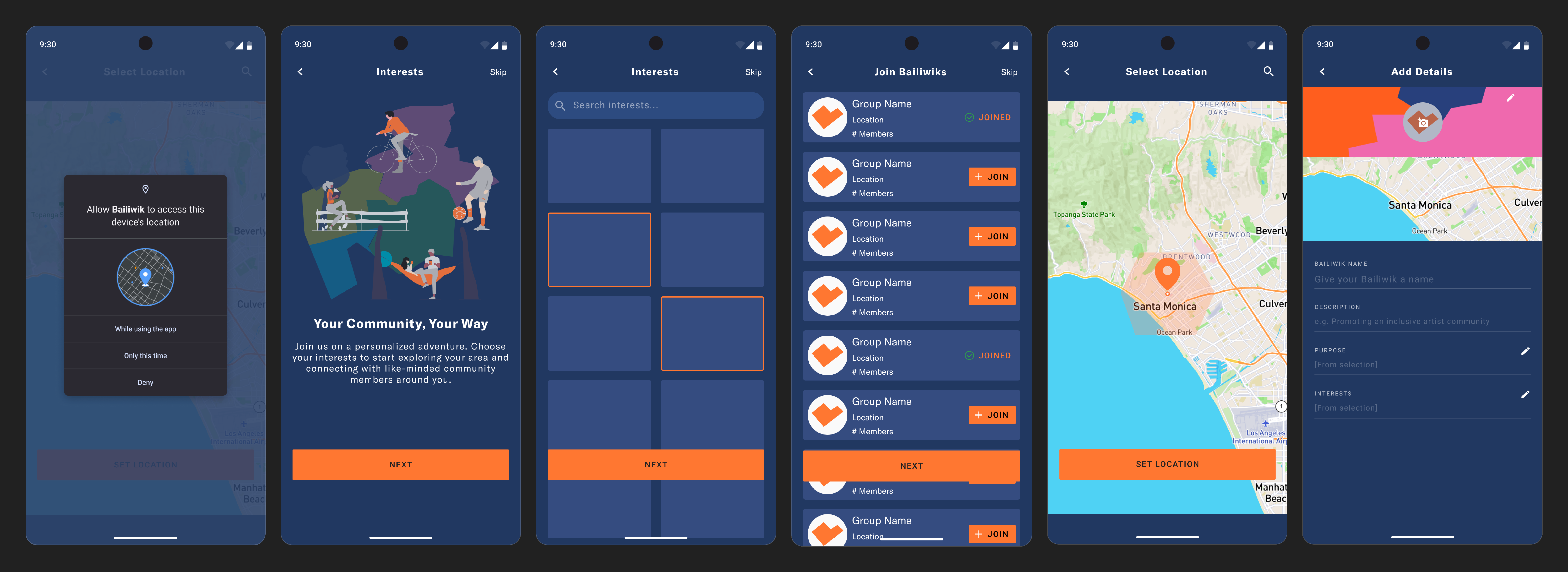
Key screens from member and host onboarding flows

Key mid-fidelity screens from member and host onboarding flows that never made to final designs

Reversing the cumbersome onboarding with a clear flow

Currently, the lengthy web-to-app transition has over 12 screens and unclear instructions. This could negatively impact user engagement and churn.

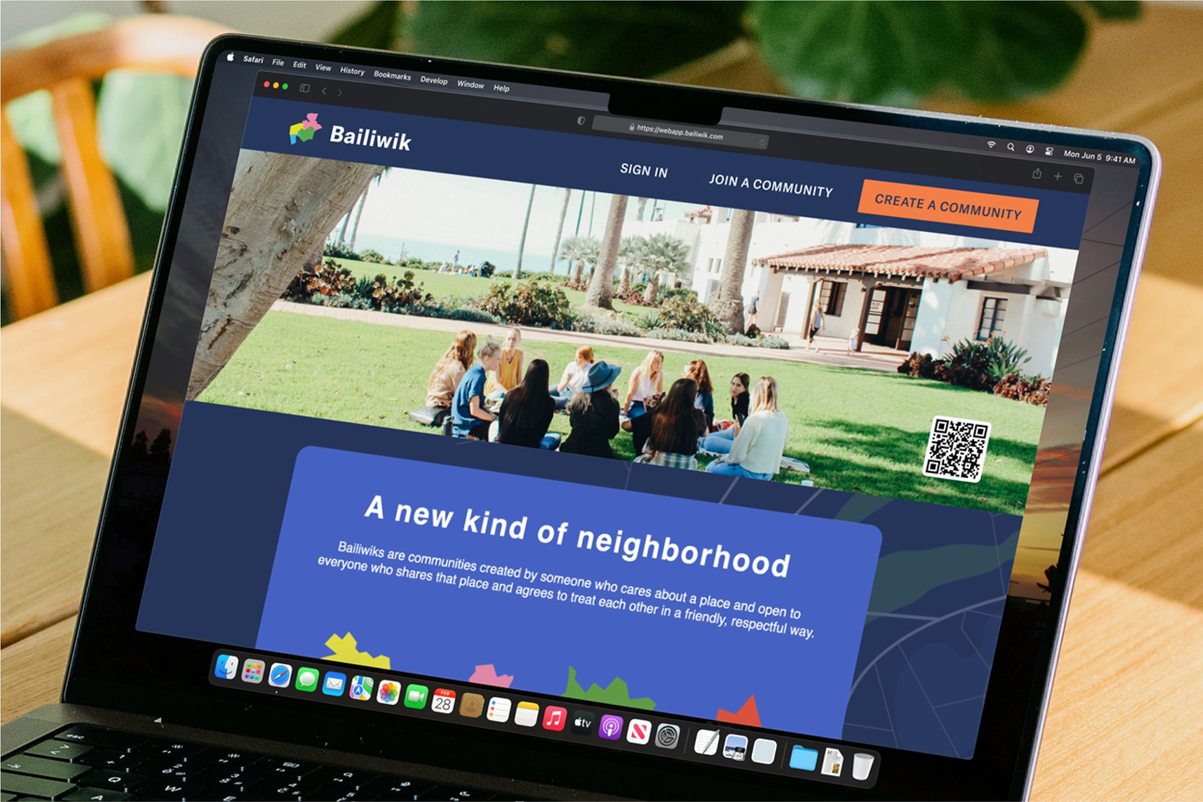
I streamlined the flow to 6 clear steps, including a prominent "Create a Community" call to action on the landing page. Additionally, as a “one more thing”, I incorporated 2 optional screens to encourage early community building to emphasize the platform’s value to its users.
Redesigned landing page of Bailiwik

Scroll to view proposed landing page

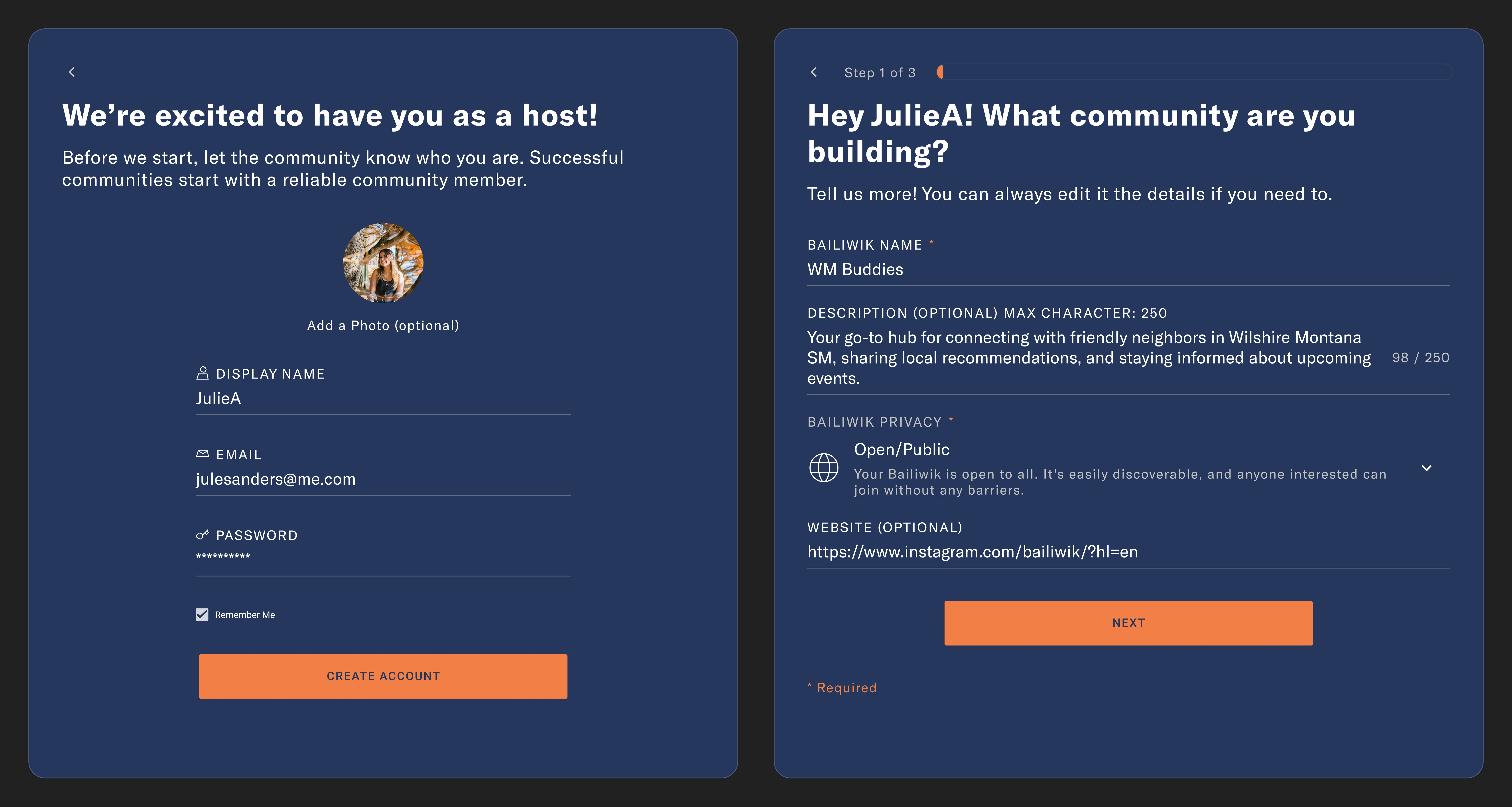
Web app screen: user sign up

Sign up screen

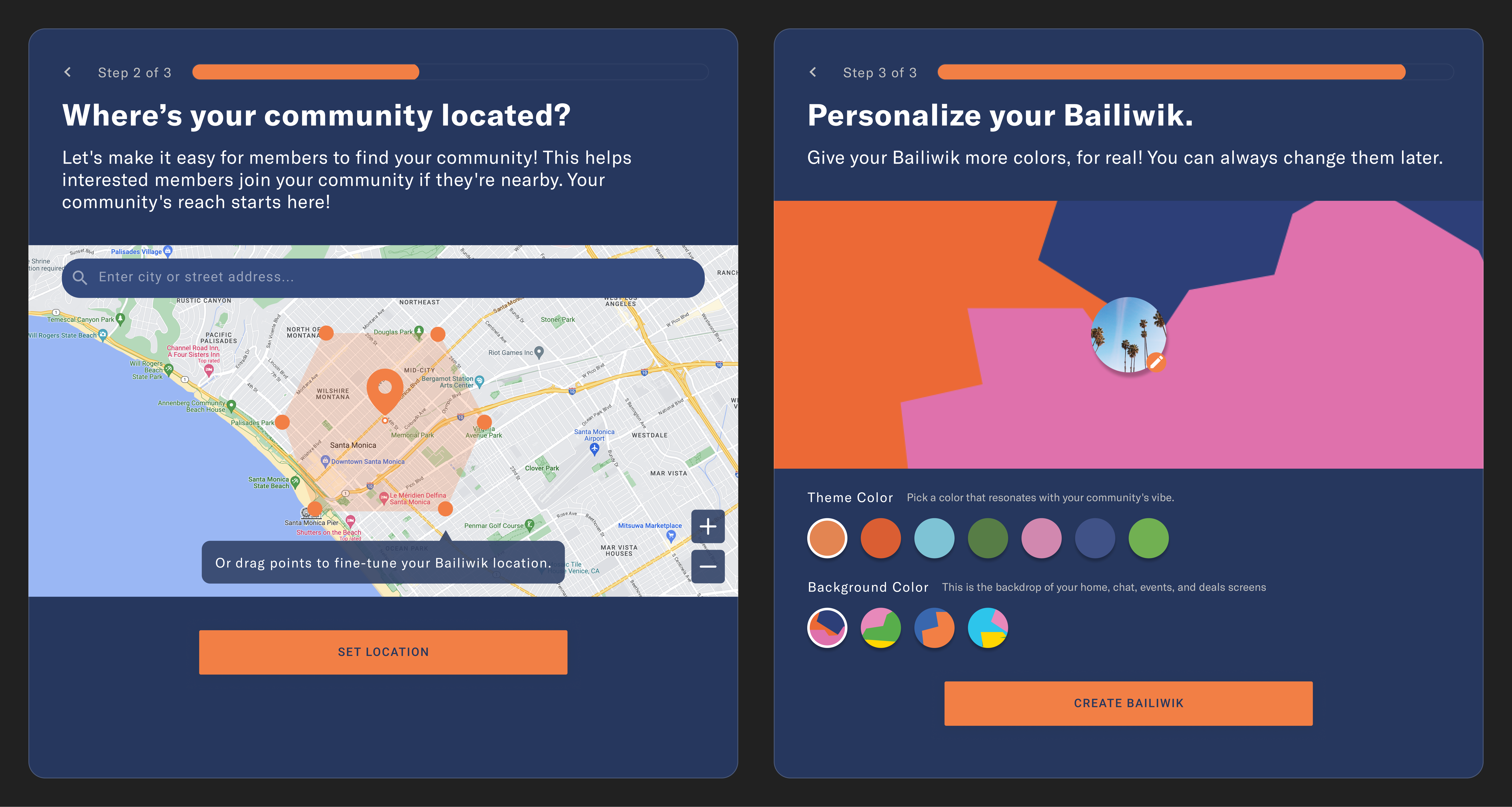
Sign up & create in 3 easy steps

Web app screen: user creating new account
Web app screen: users are prompted to provide information for their new Bailiwik
Web app screen: Users can personalize their Bailiwik with colors or add own photos

Simplified Bailiwik creation makes process easier for hosts

One more thing: Connect and celebrate

Web app screen: hosts are prompted to invite co-hosts or members to join
Web app screen: Hosts are prompted to organzie their first community event

Hosts have option to invite member or co-hosts and create event in the same flow as creating a Bailiwik

Lesson: Proactively explore diverse angles for well-rounded insight

Every project is a growth opportunity. What I learned is to not be afraid to dive deeper on client’s perspective by asking more thought-provoking questions to help them realize the real top priority. The sooner the utmost must-do is figured out, the more efficient the project work can be.

When resources become available again, I would redesign the member's “Join a Community” flow and finally add the “Interests” feature for members and hosts to enhance community recommendations based on member’s interests.

Larissa Oh

Product Designer & Experience Specialist

© 2024 larissaoh.com

• Made in Framer with chocolates and beats

Larissa Oh

Product Designer & Experience Specialist

© 2024 larissaoh.com

• Made in Framer with chocolates and beats

Larissa Oh

Product Designer & Experience Specialist

© 2024 larissaoh.com

• Made in Framer with chocolates and beats