Turning productivity debt into daily focus with a mindful 3-task app
A minimal daily tool designed, built, and shipped independently with AI tools, a clear product philosophy, and no engineering team kyo
Product Designer & Builder
0 to 1 from concept to launch
Independent product
Strategy
UX
UI
Built with AI Tools
Constraint: Build and ship a working product without an engineering team, budget, or heavy tooling
Outcome: Live PWA used daily, with the 3-task, 2-day loop tested through real use
Designed and shipped a minimalist task app that replaces backlog growth with a 3-task, 2-day focus loop.
5 days
Concept to shipped
No onboarding
Product teaches itself
Live PWA
Used daily
Most productivity apps reward adding tasks, not finishing them
You have 47 tasks on your list. You add 12 more. You finish 2. Tomorrow, you open the same app, see the same list, and add more. The tool meant to reduce stress becomes the source of it.
That is productivity debt. It compounds quietly, and most apps make it effortless to ignore.
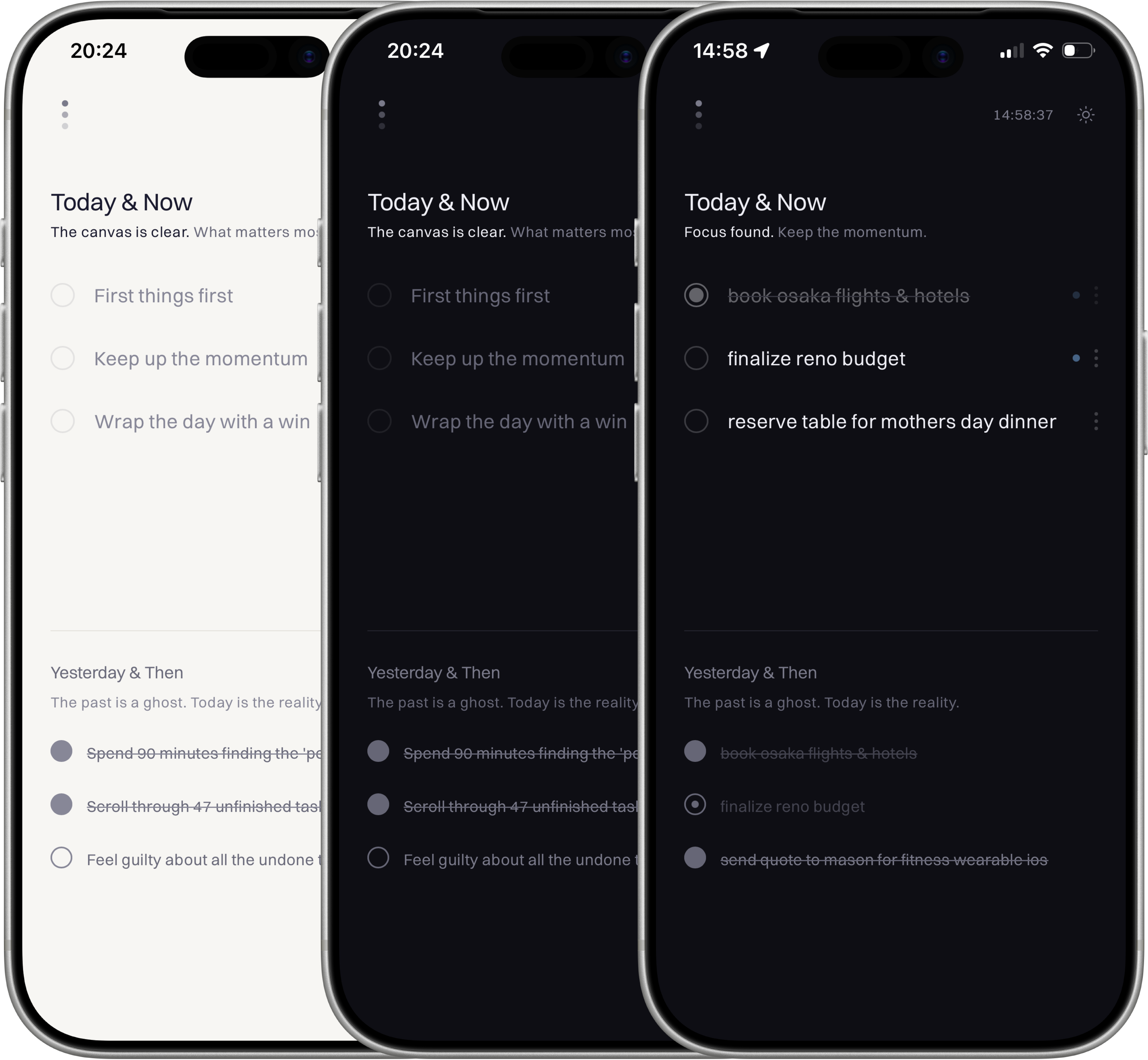
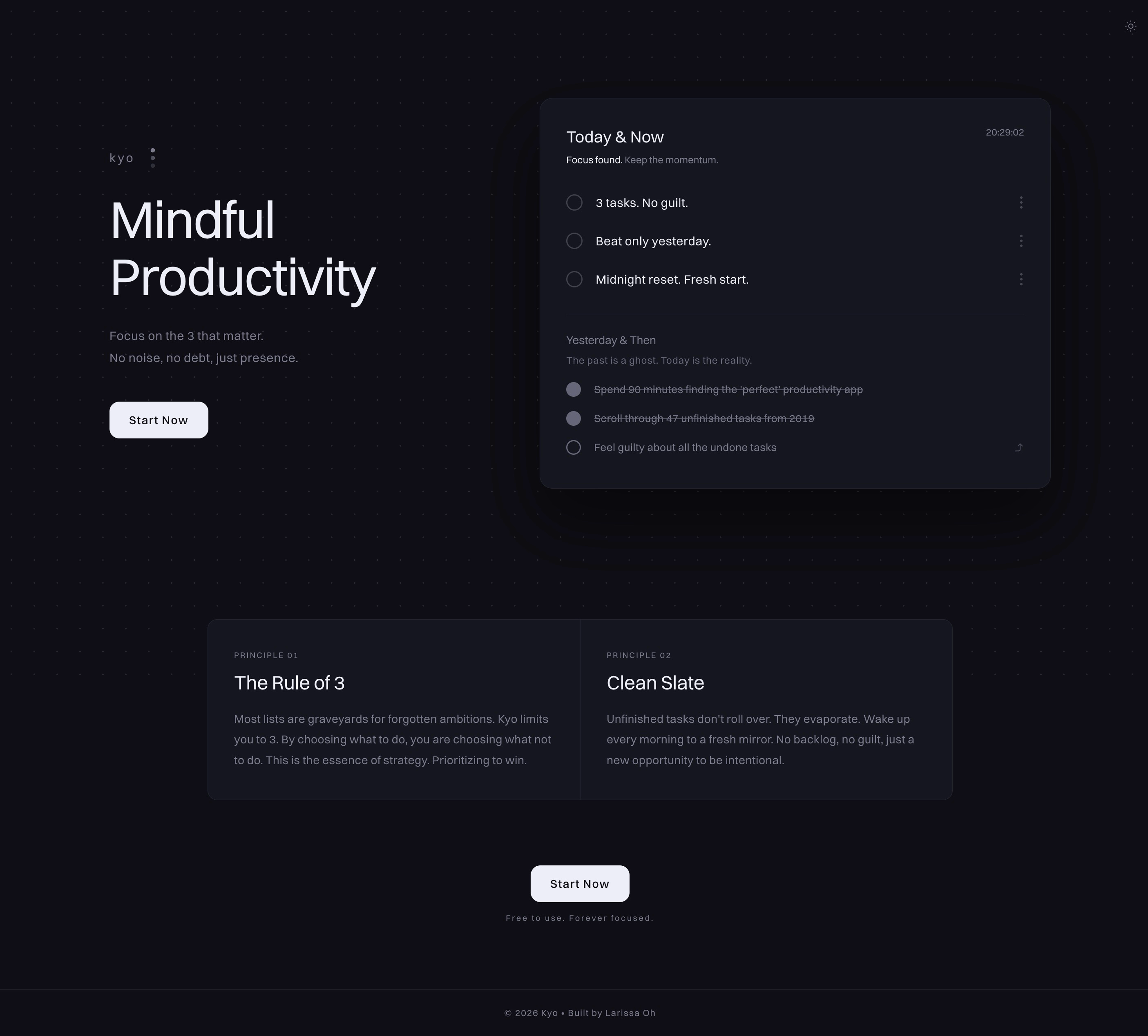
3 tasks today, yesterday visible, nothing else
Kyo shows only two days: today and yesterday.
Today is editable and capped at 3 tasks. Yesterday sits muted beneath it. Any unfinished task carries forward in one tap.
That is the full interface.
I intentionally skipped onboarding. If the product needed a tutorial, the interface was already too complicated. The 3-task cap, yesterday view, and one-tap carry-forward had to explain the product by themselves.
The 3-task cap is a nudge, not a cage. Its job is to force prioritization before the day gets noisy. The 2-day window is the philosophy. Yesterday creates accountability. Today creates focus. The loop is not “clear your backlog.” It is “beat yesterday.”
Built with AI tools, without hiding it
The concept and UX came first. kyo was designed mobile-first because daily planning often happens in small moments: before the day starts, between tasks, or when priorities shift. I defined the 2-day loop, where yesterday should live, and how carry-forward should work without friction before moving into visual direction in Google Stitch and build exploration with AI tools.
UX concept → Design direction → Google Stitch → Lovable → Claude → Figma → Claude
My workflow moved from concept to design reference to working product: Google Stitch for early visual direction, Lovable for the initial build, Claude for frontend and backend logic, Figma for interface polish, then Claude again for implementation.
Most refinement happened on the live product, not in a prototype. What feels acceptable in Figma becomes obvious when it is sitting on your phone and shaping your day.
Daily use confirmed the constraint was the right call
Seeing yesterday's tasks, especially incomplete ones, creates honest pressure. Not punishing, just straight facts. The one-tap carry-forward removes the excuse to re-evaluate indefinitely.
The 3-task cap is the constraint I have never wanted to remove. Every time I felt the urge to add a fourth, that impulse was the signal: was adding something that did not actually need to be done today. The limit surfaces that in real time. It lives as a PWA shortcut on my homescreen. That was always the intention.
What building changed
Client work shows how I operate inside someone else’s problem. kyo shows how I define the problem, set the constraint, design the loop, and ship the product myself. The value was not adding more features. It was deciding what the product should refuse to become.