•
Twos
A cross-platform productivity tool to organize life, write things down, and remember more • Twos
Product Designer • Collaborated with Founder-Developer
6 weeks • Feature add to existing web/desktop app
Freelance • UX • Product Strategy
Split view feature is expected to significantly improve experience by allowing users to seamlessly view and edit information in two separate panes, boosting efficiency. This isn’t just a cool feature, it positions Twos as a strong contender in the ever-growing PKM and productivity space, while sticking to its pledge to remain free forever.
In the first 3 months of shipping the split view, Twos experienced
⬆ 30% DAU
⬆ 40% WAU
⬆ 20% MAU
"Wowzer! This is terrific...already lovin' it"
"This is another game-changing update…"
"One of the best new features released recently"
"I use it every day. It's easy to understand and navigate"
Twos App, launched in 2015, leverages the singularity of things, individual pieces of information, to empower users to capture information easily and share it privately or publicly. While Twosers, the app’s users, enjoy capturing things on the go with the mobile app, the current single-list view in the web and desktop app hinders efficient organization. This research identified the need for better organization features to meet Twosers’ needs for deep work and managing their captured information.

Twos has thrived on primarily building around capture, especially on mobile. However, to truly empower users and unlock the potential of their knowledge, efficient organization features are crucial. Capturing ideas is just the first step. Twos must evolve to become a great tool for not just capture, but also organization.
Single-list view limits the experience. While exploring multi-content options in other tools, I realized a problem: the reliance on parent-child relationships. Twos prioritizes the “singularity of things,” meaning information functions independently, sometimes irrelevant from others. This requires search capability for the split pane.
Close collaboration with the founder-developer streamlined decision-making, allowing us to prioritize user needs while navigating technical limitations. Through research analysis and exploration with mid-fidelity wireframes, we identified a pragmatic solution: a split view feature for dual-content view. This design directly addresses user requirements and paves the way for a smoother workflow.
All Twosers who participated in an interactive prototype testing rated the split view feature a perfect 5/5 for ease of use, usefulness, and expected use frequency. While feedback included minor UI tweaks, Twosers call for clearer in-app guidance and user education on features.
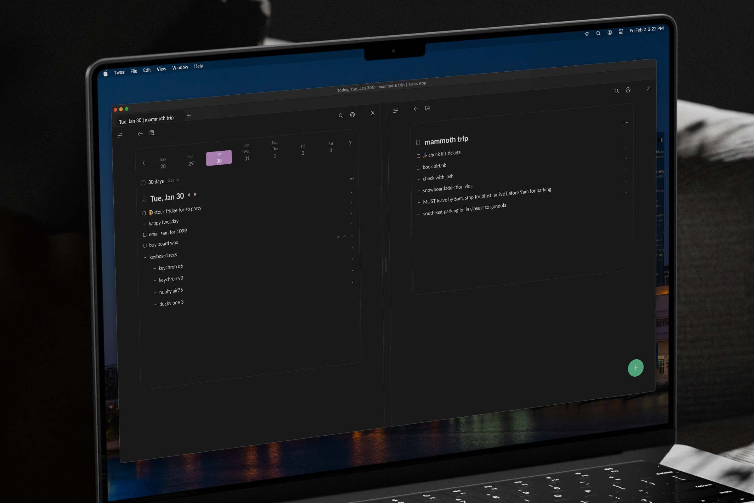
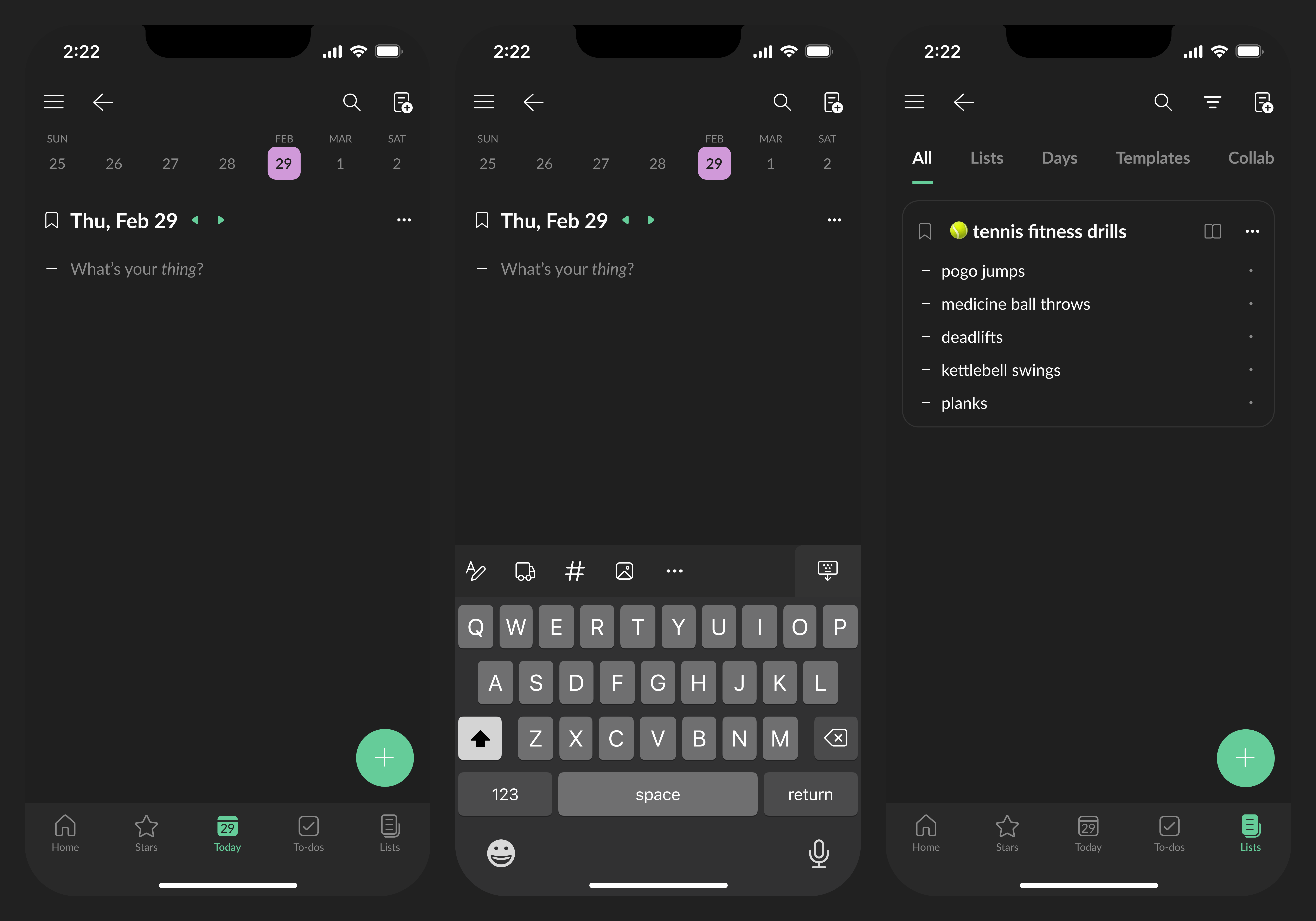
With the split view feature, Twosers are now able to work with two content panes side-by-side. Each pane offers independent navigation and search, maximizing screen space and minimizing context switching. Activate split view. Say goodbye to tab juggling and hello to enhanced information management.
To ensure Twosers discover and understand Two’s full potential, Twos team should prioritize improving update communication within the app as the next step. The more Twosers know, the more they’ll use it, stick around and help Twos grow even bigger. Win-win!