Identifying a product gap and designing a feature that grew DAU by 30% in 3 months
Cross-platform productivity tool to organize life, write things down, and remember more Twos
Product Designer
Collaborated with Founder-Developer
6 weeks
Feature for existing web/desktop app
Freelance
Strategy
UX
Constraint: Expand desktop utility without disrupting Twos’ navigation model
Outcome: +30% DAU, +40% WAU, +20% MAU within 3 months
Turned underused desktop space into a behavior-changing feature with measurable engagement growth.
30% DAU
40% WAU
20% MAU
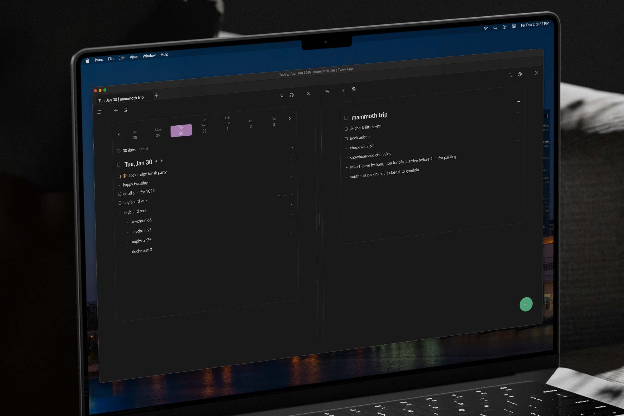
![Split view with Today and [mammoth trip] list](assets/twos/twos-finals.png)
From whitespace problem to product opportunity
Twos had a whitespace problem on web. Underutilized screen real estate with no clear direction. Talking to users revealed something more specific: they were manually splitting browser tabs to view two lists at once. The workaround already existed. The product just hadn't caught up.
Within 3 months of release, Twos saw +30% DAU, +40% WAU, and +20% MAU.
First reactions from Twosers from Discord community and release video
"Wowzer! This is terrific...already lovin' it"
"This is another game-changing update…"
"One of the best new features released recently"
"I use it every day. It's easy to understand and navigate"
Desktop users needed more than capture
Twos built its reputation on mobile, quick capture on the go. But desktop users had different needs. User interviews and Discord community threads pointed to the same friction: users doing deep work on desktop couldn't manage information across multiple lists without losing context. Single-list view wasn't built for that. The product had outgrown its own interface.
The constraint that shaped everything
Auditing how other tools handle split view, Notion, Gmail, Superlist, revealed a consistent pattern: every implementation relies on parent-child relationships. Click something in the main panel, open its details in the side panel. Logical for those products. Wrong for Twos.
Following the established pattern would have been faster to build and easier to explain. It would have also been wrong for this product.
Twos is built on the singularity of things. Content exists independently, not in hierarchy. That meant each pane needed its own navigation and search so users could open any two lists together, regardless of relationship. That single constraint defined the solution.
Working directly with the founder-developer, I designed toward what was buildable. The FAB on hover kept the build fast and added split view without disrupting the existing workflow Twosers already knew.
Validated before shipping
Prototype testing confirmed the design landed. Users rated split view 5/5 across ease of use, usefulness, and expected frequency. Feedback surfaced one consistent theme: users needed to know the feature existed. That insight fed directly into a post-launch recommendation for in-app feature education.
Split view, shipped
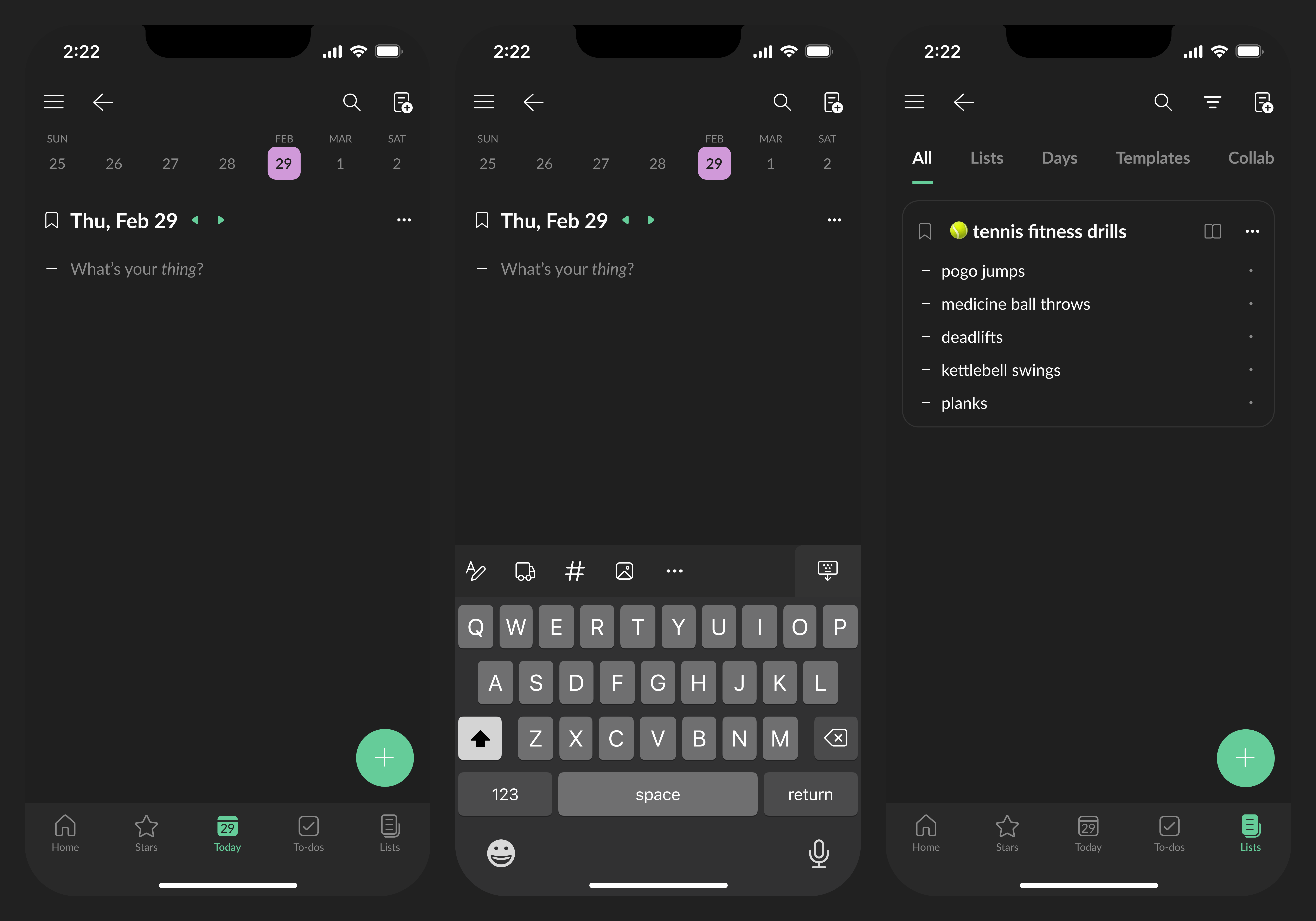
Split view with independent navigation and search in each pane. Users can open any two lists side by side, regardless of relationship, without disrupting the workflow they already know.
Shipping is step one
A perfect usability score means nothing if users don't know the feature exists. The next step for Twos is building in-app feature education: proactive communication that closes the gap between what's shipped and what's actually used. Discovery drives retention. Retention drives growth.